

“The world of interior design is changing: green architecture has gone from novelty to necessity, walls have become optional rather than essential. Conceptual statements have taken physical shape and interstitial spaces offer a new focus. Building materials have been re-imagined, landscape has become increasingly precious, and the specifics of locale are a more powerful determinant than ever.”
When Phaidon invited Jon Otis to join nine other leading design critics, practitioners, and curators to co-compile and review 100 projects at the forefront of interior design today, he accepted the challenge. His assignment: to identify 10 contemporary projects created by designers as yet not widely published, and that were constructed within the last five years.
The 416 page book, Room: Inside Contemporary Interiors can be found at Phaidon Press as well as other booksellers.
Following are four examples from Jon’s 10 selections, as well as his critical commentary of each project.
“We are looking for authentic experiences in the environments in which we live, eat, shop, play, and work,” Jon explains. “We seek meaning in the process as well as the result. Meaning that can be derived from real connections; haptic and tactile engagement with materials and textures, direct collaboration with local artisans or craftspeople, initiatives that reuse, reappropriate, and consider the environmental impact. These experiential moments create a sense of place, a ‘room’ perhaps, that can engage, inspire and delight.”
Read on, and enjoy!
Project 1: Alameda • Designer: hOmE
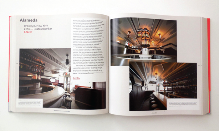
Brothers Oliver and Evan, represented by the capital letters in their firm, hOmE, have carved a unique career in design after working in restaurants and deciding to become designers while designing from an ‘inside-out’ perspective. In fact, with little formal training, they have designed some of the most tactile and intimate spaces in recent memory.
Without a strict adherence to any academic or stylistic references, hOmE works with inspiration from existing site conditions, the context of textures, old-New York objects and materials to create spaces that feel good for those who engage with them. In fact, their approach is often ‘spontaneous and inventive’ according to Oliver Haslegrave, and more directly about ‘experimentation and craftsmanship,’ aligned more with another era than with contemporary references. A studious process normally commences each project, involving researching the site, materials, styles and sensibilities and informing the project at hand.
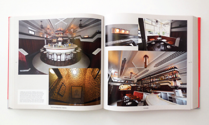
In Alameda, which might evoke something out of the Vienna Secession, the designers sought to maintain many existing details and used them for the new design’s inspiration. Their focus on materials and details is evident in this restaurant; which favours a neutral palette, reclaimed purple-heart wood and custom-designed lighting in order to define the space and create a tactile experience and a feeling of worn-warmth. They found an inherent geometry in many of the details and enhanced it with angular tiles, evoking the New York subway. They like mirrors too, and use them both to reflect and enhance the space, and for writing dinner specials.
Alameda feels like it’s always been there — there exits a timeless quality about the leather banquettes, the white tiles and purple-heart wainscoting, plaster ceiling and linear geometric details. If you amble up to the concrete bar, you see the steel and wood shelving, refined yet classic, and beer taps that, it can be stated, feel like home.
Project 2: Aesop • Designer Tacklebox Architecture
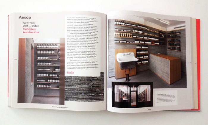
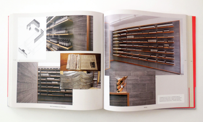
When Tacklebox principal Jeremy Barbour was invited to Melbourne, home of Aesop skincare products, he thought it curious, as he was only being asked to design a simple small kiosk in New York’s Grand Central Terminal.
Yet after ten days, immersed in familial brand relationships with the company’s owner, he understood how to approach the project at hand. The direction of the project emerged from Barbour’s inclination to ‘calibrate constraint’ and to understand the ‘spirit of the brand,’ and the knowledge that he had a very open-minded and collaborative client.
He began by considering the nature of Grand Central Station, including the temporal tendencies of commuters moving rapidly about, and the acoustic qualities that emanate from that edifice when ‘fully loaded.’ This, together with his (as it turns out, his client’s) fondness for the written word, led him to explore a concept of creating a place that is defined by a material measure of time that was inherently based on the transient nature of newspapers. Thus the material became the central structure of the kiosk, and then for the project featured here, the Aesop store in the NoLITa area of New York City.
The store fixtures were designed and built off-site and installed in seven days. The 400,000 sheets of New York Times newspapers were sent to a local Korean archival bookbinder and pressed and cut and glued together with archival glue, so that literally he states, ‘the store is bound like a book.’
This simple, austere and certainly quiet retail skincare outpost is carefully crafted, and while appearing almost ‘modular,’ there is a great deal of well-articulated craftsmanship and the prototyping that led to it. This project is testament to an idea, an experiment and a successful resolution that achieves a high aesthetic on a relatively low budget.
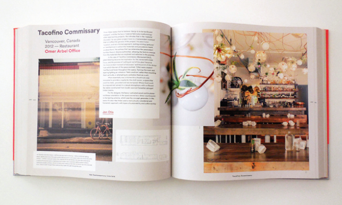
Project 3: Tacofino Commissary • Designer Omer Arbel Office
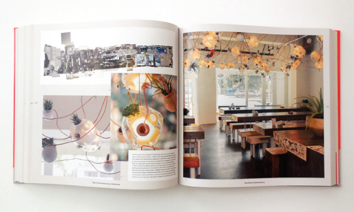
Omer Arbel states that he believes ‘design is to be a tactile and engaged’ and that he has a ‘material fabricator methodology’ when approaching projects. He indicates that in the ‘material discovery’ for any give project there is a ‘transcendent moment’ that is in effect the genesis of the project. He sees it as a ‘curation,’ and not a formal approach, lacing existing ‘gestures or predilections’ in which ‘materials and procedures teach us about form.’ He outlines that ‘we determine the parameters, but that there is diverse authorship,’ allowing the form to emerge from the materials that are explored and selected in the process.
In the case of Tacofino Commissary, glass-blowing became the inspiration for the restaurant’s main focus, and the process of ‘pulling air out of the glass’ became the ‘transcendant moment of discovery’ and the point of the design from which the rest of the space evolved. ‘Orbs’ were created that float and hover throughout the space, framing the room and layering lighting as a strata or ‘field condition’ rather than mounting them vertically or attempting to centralize them as a unit.
What essentially was a kitchen for a food truck was renovated to provide a respite for the chef-owner; a space that could be static, grounded and less temporal. Where food could be prepared and served in a casual atmosphere, with surfboard-like tables constructed from locally sourced Canadian salvaged timber beams.
For the designer, the heavy rusticated wood and its planer-rectilinear orientation in the space served as a direct counterpoint to the lighting scheme, which was the concept-generator. In this space it’s clear that Arbel used a meticulously considered and humanistic approach, with layers of sustainability and craftsmanship.
Project 4: Wythe Hotel Public Spaces • Designer: Workstead
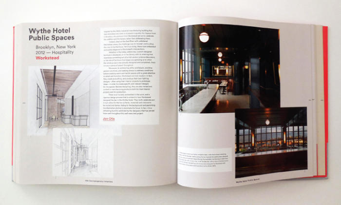
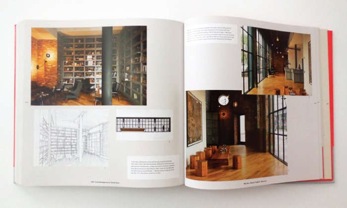 Inspired by the 1900s industrial manufacturing building that was renovated into what is at present arguably the hippest hotel in Brooklyn, the partners from Workstead set out to celebrate the oddities and the history rather than obliterating them.
Indeed, sited on the East River with unfettered Manhattan views, the challenge was to ‘recede’ and to allow the view to be the focus. Yet in so doing, there is an embedded and subtle elegance in Workstead’s interventions.
Whether in the lobby, where raw, custom-designed furniture is displayed, or in the library, with its shelving that resembles something out of a mid-century science laboratory, or the mix of furniture that keeps you guessing as to when the whole project was actually designed and completed, there is truly a sense of ‘place’ throughout.
Moreover, by embracing utility and beauty, avoiding generic solutions, and seeking always to address conditions before creating warm and tactile spaces with great attention to detail and function, Workstead is truly modern. In fact, they create everything, and produce their own lighting designs — often using their interior projects to prototype ideas — in order to create specific and relevant designs for the spaces. Besides designing, they are also versed and current in manufacturing products both for their interior projects and for production.
There is an honesty embedded in the work; and a rigorous design process that is evident in how Workstead design the bar in the Wythe Hotel. They both celebrate and in turn allow for the bar surfaces, materials and colours to be muted and darker, fading to the background and permitting the Manhattan skyline to dominate the focus. In face, it is a refreshing humility exhibited by the designers that has served them well throughout this well-executed project.